Corporate logos must be precisely what the customer perceives because they reflect their business. Digitizing them requires precision and communication with clients to protect their image and branding. This article will teach you 3 crucial tips that you should always keep in mind and put into action when digitizing company/corporate logos.

Digitizing Logos is Different than Digitizing Regular Embroidery Designs
Things aren’t always as simple as they seem. Take, for example, a corporate logo: a mere design with letters around it, right? Maybe so, but digitizing corporate logos is more challenging than working animals or floral designs. If I’m digitizing a wolf, the sew out is based on my interpretation of it, but corporate designs must be exact – the customer’s logo reflects their identity and is therefore sacred. So sacred that I’ve had customers measure designs to the millimeter and look at stitches under a magnifying glass.
Back in the 1990s and early 2000s I ran & owned one of North America’s largest commercial digitizing houses. We did work for dozens of fortune 500 companies like Disney, the NFL, Coca-Cola, John Deere, and many more. During this timeframe, because most of my orders required digitizing corporate designs, I learned to educate my customers about how their logos translate into stitches to stave off potential problems before they happen. Here are 3 time-tested tips that’ll help save you, and your customers, hours of frustration:
1. Altering Logos to Make them Digitizing / Embroidery Design Friendly
Before you begin digitizing the design, the first challenge is figuring out what to do with the artwork you receive from your customers. Sadly, most business owners don’t have embroidery in mind when creating a corporate logo. Designers create striking graphics that look great on letterhead but don’t translate well into stitches on a golf shirt.
Almost every design you receive must be tweaked to work well in embroidery; how you let your customers know about design modifications is crucial. Common situations you’ll encounter include:
- The design is relatively embroidery friendly; any modifications will be slight and won’t affect the design’s integrity. In this case, I don’t contact the customer.
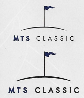
- Lettering needs to be enlarged to meet embroidery minimums or kerned to avoid trims and jumps. Multiple borders may need to be minimized. Here, I’ll verbally let the client know about these small alterations.
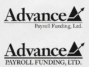
- Layout changes are necessary, or the designs details are too intricate for embroidery and are therefore being simplified. In this scenario, I contact the customer and show him the changes.
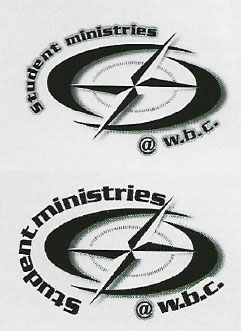
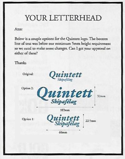
When I send revisions to customers, I include a form for them to sign with their approval.
Pro tip: Always get the customers approval in writing before making any changes to their logo to make it “embroidery friendly”.
If you settle for a verbal OK, odds are your contact didn’t show the changes to the end customer. And if the end customer complains after the order’s complete, you’ll end up in a your-word-against-his battle, which you’ll probably lose to keep your customer.
Decisions, Decisions
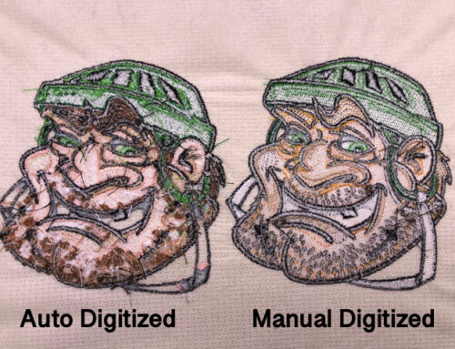
Some customers resist alterations you make in preparing their designs for embroidery. In this case, show them the difference between embroidering the logo their way vs. your way instead of telling them that they must accept your version. I create a page showing the original logo as the customer sent it, a ludicrous option that I know he won’t go for, and a third version I’ve edited to accommodate embroidery. My customer is happy that he has options, and I know he’ll end up choosing the one I intended him to pick. Make sure you don’t give the customer more than two options; otherwise, you’ll waste time explaining each one’s pros and cons.
2. Taming Logo Text when Digitizing
The text makes or breaks corporate logos. If the logos graphic element is perfectly digitized, but the text is sloppy, the customer will notice the shoddy letters. When letters are placed directly on a garment (meaning they won’t be sitting on any fill stitches), I use all uppercase block letters at 5mm high. When you digitize upper and lower case 5mm lettering on knitted fabrics, stitches close up, make text illegible.
Sure, smaller lettering is possible, but you can’t guarantee the results on every application. Suppose a customer tells you a design is only going on nylon jackets, and you digitize the logo to go only on nylon. In that case, it never fails that the client calls back, saying he decided to use the design on golf shirts instead, and the embroidery looks terrible. The point is you must tell customers that designs react differently depending on the fabric type.
If you want to learn how to digitize your own text, we do cover that specifically in Level 2 of our fan-favorite Digitizer’s Dream Course. If you’d rather use “keyboard fonts” that are built into embroidery software I highly suggest using ESA font technology. Given ESA fonts are 100% object based, you can easily adjust them to fit customer needs instead of digitizing the letter “A” 1,000 times. Want to learn more about how to get clean, crisp embroidery lettering every time with ESA fonts? Click here for our complete guide to machine embroidery fonts.
3. The Larger the Embroidery Design, the More Detail You Can Digitize Into the Logo
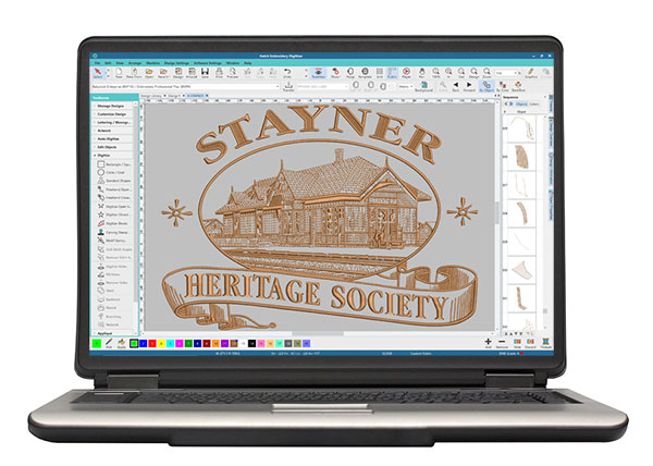
How much detail stays in a logo depends on the final size: the larger the design, the more detail. Look closely at the images in the “Stayner” design, a single-color logo digitized for the full-front on a sweatshirt.
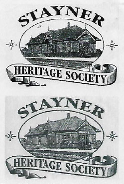
When you compare the original art to the finished stitched sample, you’ll notice that we didn’t digitize many of the lines.
It’s all in the details
Understanding how much detail to include in a design comes only with experience. After dealing with thread properties and seeing how its mass interacts with fabrics, you get a feel for it. In the meantime, learn more about the main fabric categories used in machine embroidery by clicking here.
We use three basic stitch types when digitizing: running, satin, and fill stitches. A running stitch has about a 1mm mass in itself, satin stitches should have at least a 2mm throw, and fill stitches are generally used to cover areas larger than 8mm (if you want to learn more about stitch settings for the 3 primary stitch types, click here to gain access to our Free Embroidery Digitizing 101: Cheat Sheet PDF & video course). Learning when to use each stitch and knowing how to tweak their relative values to create dimensional embroidery is important, as is understanding that embroidery reflects light depending on the direction of the stitches.
An example of digitizing corporate logos:
Now to show you first hand how I would digitize a corporate logo, and some age-old digitizing theory in action here’s a video I filmed showing you how I went about digitizing a more complex logo:
Conclusion: Use These 3 Key Steps to Excel From Practice to Perfection
Alter customer logos to ensure it’s digitizing and embroidery design-friendly:
Although many logos look great on letterhead, it doesn’t mean it will translate well into stitches. Depending on how the logo turns out once stitched, it’ll give you an idea of how to confront your customer regarding alterations. If you need to inform the customer of any changes necessary, always get the customer’s approval in writing to avoid any confrontations.
Depending on what the customer wants to be embroidered, small text is not always possible
Embroidery reacts differently depending on what fabric the design is being embroidered on. Although your customer may want a smaller text, it may not work with particular fabrics; therefore, you need to improvise so text can be legible.
The larger the embroidery design, the more detail you can include in the logo.
The only way to know how much detail to have, or not to have, comes from knowing the age-old theory and rules behind creating soft machine-friendly embroidery designs.
These pointers will serve you well with corporate work, but nothing helps as much as experience and learning the theory behind digitizing. Although embroidery software has changed over the years, the principles of how thread reacts with different fabric types to create smooth-running embroidery have not. Of course, that theory cannot be cover in a short article such as this one (which I’m sure doesn’t surprise you). If you’re new to digitizing, I would highly suggest you check out our free Embroidery Digitizing 101: Cheat Sheet video course. You’ll learn more about embroidery digitizing, and it will give you a foundation of embroidery digitizing theory that’ll help you understand designs and what’s happening underneath your needle. Or if you know digitizing is something you’d like to pursue, I would advise you to check out our fan-favorite Digitizer’s Dream Course. With thousands of students successfully completing this course to learn how to digitize and proven results, I’ll help get you past the learning curve quickly and on your way towards digitizing corporate logos you can be proud of.
So get punching and remember, every corporate design you digitize makes you a better digitizer.
Subscribe to our newsletter and follow us on Facebook for free education and giveaways, we look forward to seeing your progress and growth!
Happy stitching!

Thank you for these words of wisdom. I have struggled with lettering in logos. Case in point, we had one horrible job that now we hilariously say, “Remember the Scone job?” when things get tough. Lol. You are appreciated.
It always helps to have a positive outlook on any situation, thanks for reading Bonnie!
Although I’ve trudged through many a design blindly and figured it out through trial and error I always learn something new in each article or video I watch from John. Thank you and please don’t ever slow down!
Thanks for your kind words Jim, appreciate it!