When it comes to bringing embroidery designs to life and creating designs that draw the eye, blending thread colors is one of the most impressive tools in a digitizer’s toolbelt. Over the last couple of years, we’ve had many customers ask the secrets to achieve this advanced technique, and we’re going to guide you in the right direction to learn how.
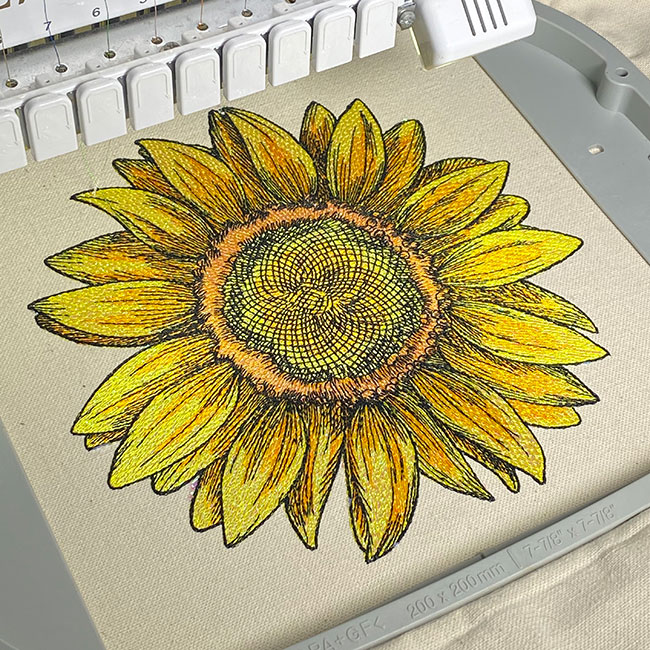
It seems over the last decade, corporate logos have become more and more graphically intense. Corporate logos are created to promote the visual appearance of printed matter and signage. Our problem begins with the fact that when you’re dealing with needle and thread compared to all other graphics-related industries, we need to deal with limitations that don’t apply to anybody else. You can put as much ink as you want on a piece of paper, but you can’t say the same for stitches on clothing.
Logos have especially become more graphically intense with the use of color blending and variegation. When dealing with large oversized designs, the success of interpreting this technique is much easier to deal with; the tricky part starts when we are asked to use these applications on designs that are smaller or need to be placed on the front of a baseball cap.
P.S. Before we dive in one of the best ways to learn is to do! For that reason, we’ve created an advanced artistic-merit color blending embroidery digitizing lesson. Click here to learn more.
Color Blending Levels in Machine Embroidery
Blending and variegation can be broken down into many different levels depending not only on the artwork but also on the applications and the software functions you may or may not have.
Manual Blending in Digitizing

The first of these would be the technique of manual blending. This is the use of placing manual stitches randomly to replicate your artwork. This is notably more time-consuming, and it helps if you have a bit of an artistic flair.
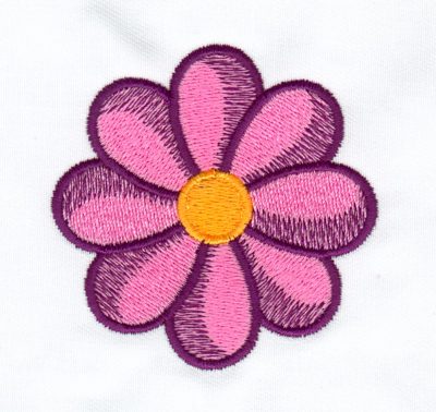
Blending is typically used in conjunction with regular fill stitches of different colors, using first a regular fill density for your base color and a looser density running on top of the first in the same direction. Ensuring that all your stitches run in the same direction is the main thing to look for; the fills will sink into each other, giving a softer blending of both colors. This technique can be used very quickly to give the illusion of depth and light reflection while using the regular fill tools available on all systems.
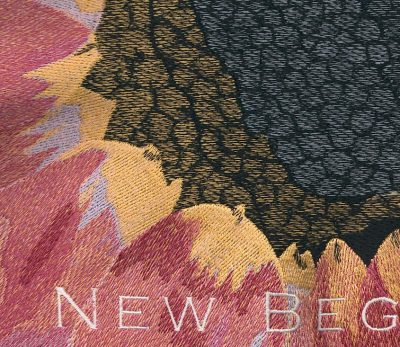
You can also take it a step further by increasing and decreasing the density values while using the same colors in your design. For example, this was the case while digitizing this flower design.
Color Blending within Digitizing Software
Achieving a realistic variegated effect can be as easy as clicking a button if these functions are available in your software. Within some systems, you can purchase these functions independently or upgrade to a level that does provide this utility. If I were to choose to purchase any of the “bells and whistles” available within some of the higher levels of today’s software, this one would probably be one of the most practical.
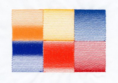
Here are some examples of some common variegated effects that are created at the click of a button.
How to Replicate Color Blending in Digitizing
There are always ways to cheat the system, so don’t fear if you don’t have the variegated effects tools within your software. It is very easy to replicate this function by using your drawing tools and running stitches.
The first thing you need to do is digitize your base color with a standard value fill. Then digitize your second color using the same values to the point that the two colors meet. This is where your drawing tools come in; if your fill density value is at, say, .35mm, you’ll need to start your variegation at about .45mm and span to about 2.00 mm.
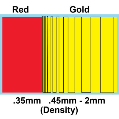
Depending on the area that needs to be variegated, you will draw your lines fanning out between the two density values.
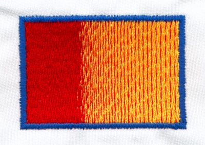
After your lines have been drawn, use your running stitch tool and set your stitch length to the same length as your fill stitch. Then follow the path of your drawn lines.
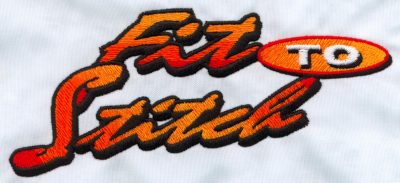
As always with embroidery, color selection is everything; when blending groups of colors as in the “Fit to Stitch” design, they are all spectrally friendly. Especially when doing variegation on lettering, choosing color groups that flow together will be what sells the design. If you use colors that clash with each other, the blending effect can be lost.
Problems with Color Blending in Machine Embroidery
The biggest problem we’ve encountered with trying to achieve variegation and blending on smaller left chest and hat designs is making these areas look as clean as possible.
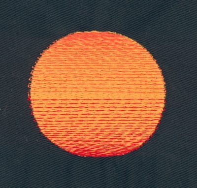
If you’ve already digitized small areas with these effects, you might have noticed that it always ends up having an unfinished and jagged look to it no matter how hard you try. (Shown in the image above).
If you’re blending multiple colors on top of each other, the change of densities as they are applied can easily make what is supposed to be a straight or curved line lose its shape and appear jagged.
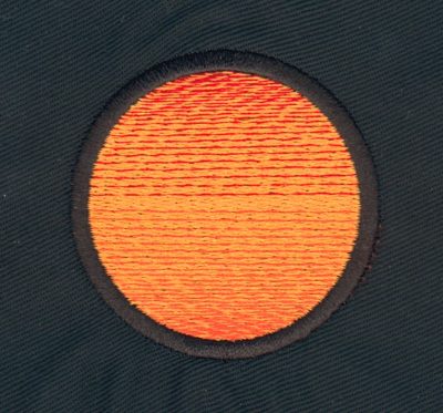
Our solution to this problem has proven itself successful in rectifying both these situations. We will add a column stitch around the outside of the object, in the same color as the fabric it’s being applied to (demonstrated in the image above). This gives you a place to hide those rough-looking stitches and keeps the desired shape intact no matter how busy things get. So that perfect circle that the customer was expecting won’t end up looking like an egg!
If you’re digitizing professionally, a good policy, whenever a noticeable change is made to your customers’ artwork, I wouldn’t just spring this little solution on your customer without first giving them a call and properly explaining the end results.
How to Successfully Color Blend when Digitizing
What sets one digitizer apart from the rest is their ability to map a design to its completion while always keeping in mind its run ability in production. Someone can digitize the most beautiful design in the world, but if it doesn’t run well then, it’s worthless.
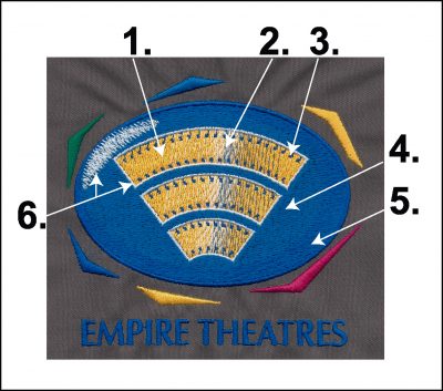

This “Empire Theatres” logo is an example that encases both variegation and blending. But also has a lot of elements that look difficult if you’re trying to path a design properly, keep registration of the colors intact, or not distort the shape of the oval. Here is a point-by-point rundown of the sequence of colors digitized.
- Gold fill for film digitized vertically.
- White and Blue variegation digitized traveling without any jumps.
- Purple film tracks digitized, walking into fill direction to avoid jumps.
- Royal Blue oval digitized horizontally.
- Purple blending to show the reflection of light and column around oval.
- White highlight and thin columns around film.
The sample is the result of the first sew-off, and no further editing was required. With proper mapping and thinking of creative ways to hide those messy stitches, the proper use of blending and variegation will set you apart from your competition.
Color Blending Digitizing Lesson
Are you interested in learning more about the age-old digitizing rules and theory? How about how to properly layer different thread colors, how using opposing stitch angles can change your eye perception or how you can use a combination of stitch types to create dimension?
Our Advanced Digitizing Lesson Artistic Merit and Color Blending Techniques will teach you everything you need to know using our proven hands-on approach to learning how to digitize alongside John Deer, the world’s most awarded digitizer.
Click here to check out our Artistic Merit Color Blending Lesson & learn more about what it entails.

Throughout this lesson, John teaches you how to blend thread colors like paint with digitizing. He walks you through digitizing the detailed sunflower design as seen above, from start to finish while incorporating the different techniques. The best part? It’s 3.5 hours of interactive video where you can start and stop as you please. So really, the speed you learn is at your own pace. It also remains in your classroom indefinitely, so you can refer back to the lesson whenever you need!
Conclusion: Blending Colours In Digitizing Takes Practice
Learning to blend colors within your embroidery designs has become highly sought after within the digitizing world. As I mentioned at the start of this article, nothing brings a design to life and draws the eye like professional color blending.
The way your stitches run, the colors you use, and the techniques you use to create illusions will greatly impact how well your color blending techniques work.
If you want to learn how to layer your thread colors using proper stitch angles and use different combinations of stitch types to create dimension past what was covered in this article, don’t forget to check out our Artistic Merit Color Blending Lesson. This lesson will go into more depth than this article and help you take your embroidery digitizing to the next level. Click here to learn more now.

Excellent blog and information.
Your step-by-step instructions are very good, it is what I would call, start with the end in mind.
Thank you for all your information. I know you have so many tips and tricks for us, it would take 3 lifetimes to learn everything.
My pleasure Pat, very happy I could help.
Also, thanks for the kind words!
Thankyou John this is so very informative. I can’t to
To work with it
My pleasure Suzan, enjoy!